Picture this: you're driving through a New Jersey neighborhood in December, and every roofline glows with red and green C9 bulbs against the winter night. Without thinking, your heart lifts — these colors instantly signal warmth, celebration, and home. But have you ever wondered why red and green became the universal language of Christmas? The answer lies deep in human psychology, cultural evolution, and centuries of symbolic meaning that continue to influence our holiday decorating choices today.
The Ancient Roots of Red and Green in Human Psychology
Long before Christmas existed, red and green held powerful meanings in human consciousness. Red, the color of blood and fire, represented life, passion, and vitality. Our ancestors saw red in the setting sun, in ripe berries that meant survival, and in the flush of healthy skin. Psychologically, red triggers arousal, excitement, and attention — qualities that make it perfect for celebration.
Green, meanwhile, symbolized life, growth, and renewal. In a world where winter meant potential starvation, evergreen trees represented hope and continuity. The color green literally meant survival — fresh shoots, healthy crops, and the promise of spring. Together, red and green created a psychological balance: the excitement of red tempered by the stability of green.
Modern color psychology confirms what our ancestors felt intuitively. Red increases heart rate and creates urgency, while green calms and reassures. When you string red and green lights along your roofline, you're tapping into thousands of years of human emotional programming.
Victorian Era: When Christmas Colors Became Official
The Victorian era (1837-1901) transformed Christmas from a religious observance into the family celebration we know today. During this period, red and green officially became Christmas colors through a perfect storm of cultural factors.
Queen Victoria and Prince Albert popularized the Christmas tree tradition in Britain, bringing German customs into mainstream culture. Victorian illustrators and publishers began standardizing Christmas imagery, consistently depicting Santa Claus in red, Christmas trees in natural green, and holiday scenes dominated by these two colors.
The rise of mass-produced Christmas cards cemented the red-green tradition. Publishers discovered that red and green created the most striking contrast on printed materials, ensuring their cards stood out in shop windows. Thomas Nast's famous illustrations of Santa Claus in Harper's Weekly (1860s-1880s) showed a jolly figure in bright red, while Christmas tree illustrations emphasized the rich green of evergreen branches.
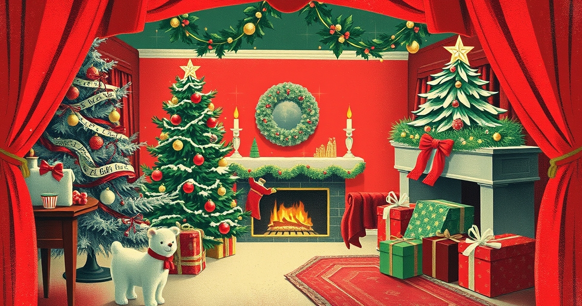
Victorian homeowners embraced these colors in their decorations. Red ribbons, green garlands, and the contrast between red ornaments and green tree branches became the standard. This era established the color combination that would dominate Christmas decoration for the next 150 years — including the red and green C9 bulbs that grace New Jersey homes today.
Cultural Associations with Seasons and Nature
Red and green's Christmas dominance isn't just cultural — it's seasonal. These colors appear naturally during winter months, creating subconscious associations that reinforce their holiday meaning.
Consider the December landscape in New Jersey: bare brown branches contrast against evergreen pines and spruces, while bright red cardinals flash against the neutral winter backdrop. Holly bushes produce vibrant red berries against dark green leaves. Poinsettias bloom in perfect red and green combinations. Nature itself seems to celebrate in Christmas colors.
This seasonal timing creates powerful emotional connections. When we see red and green together, our brains automatically associate these colors with winter, comfort, and celebration. A string of red and green lights doesn't just decorate your home — it signals to every passerby that here is warmth, welcome, and holiday spirit.
The agricultural calendar reinforced these associations. December marked the end of harvest season, when red apples and green winter vegetables provided crucial nutrition for surviving winter months. Red represented the preserved foods (cranberries, apples, preserved meats) while green represented the few fresh foods available (winter greens, stored herbs). Together, they meant abundance and preparation.
Modern Color Psychology and Emotional Impact
Contemporary research reveals exactly why red and green create such powerful emotional responses during the holidays. Color psychology studies show that red stimulates appetite, conversation, and sociability — perfect for holiday gatherings. Green reduces eye strain, promotes relaxation, and suggests security — ideal for creating welcoming home environments.
The contrast between warm red and cool green creates visual excitement without overwhelming the eye. This complementary color relationship ensures that red and green decorations remain visually appealing for weeks, unlike other color combinations that might tire the eye quickly.
Marketing research confirms the power of Christmas colors. Retailers report that red and green packaging increases holiday sales by up to 30% compared to other color schemes. The colors create instant recognition and emotional connection, triggering purchase decisions before customers consciously think about them.
For homeowners, choosing red and green holiday lighting creates subconscious comfort for visitors and neighbors. The colors signal tradition, stability, and welcome — important social cues during the winter months when community connection becomes especially valuable.
Modern Color Trend Variations and Innovations
While red and green remain Christmas classics, modern designers have discovered sophisticated ways to incorporate these traditional colors into contemporary holiday displays. The key lies in understanding color temperature, intensity, and proportion.
Deep burgundy paired with sage green creates an upscale, sophisticated version of traditional Christmas colors. This combination maintains the psychological impact while feeling fresh and modern. Many of our New Jersey clients choose this approach for their residential lighting installations, particularly in historic neighborhoods where subtle elegance suits the architecture.
Lime green with cherry red offers a playful, energetic variation that appeals to younger families. This bright interpretation maintains the essential red-green relationship while feeling contemporary and fun. It works especially well for commercial displays that need to attract attention.
Rose gold and forest green represent the latest evolution in Christmas color trends. Rose gold provides the warmth and excitement of red while adding metallic sophistication. Forest green grounds the display with natural, calming energy. This combination appears frequently in high-end retail displays and luxury residential installations.
Professional lighting designers now layer different shades of red and green to create depth and visual interest. Instead of using single-tone red and green bulbs, they might combine warm white lights with red accents and various green foliage, creating a complex color story that feels both traditional and contemporary.
Choosing Red and Green for Your Holiday Display
Understanding the psychology behind Christmas colors helps homeowners make smarter decorating decisions. When planning your holiday lighting, consider how different shades of red and green will impact your display's emotional effect.
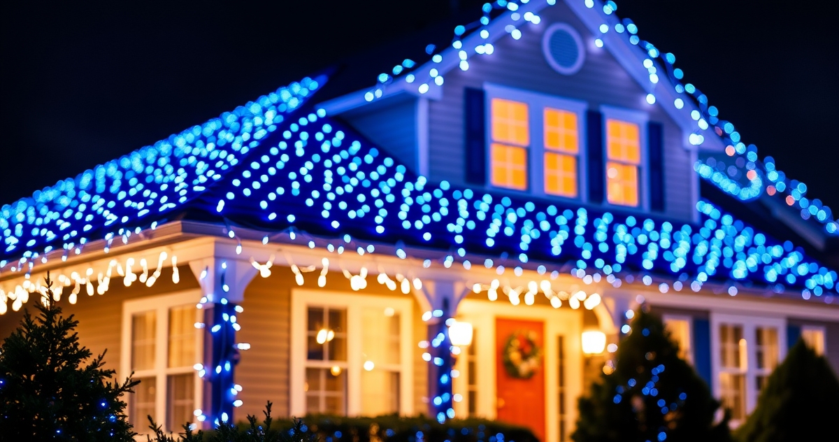
Traditional bright red and emerald green create maximum impact and instant Christmas recognition. This combination works beautifully for families who want their home to radiate classic holiday spirit. C9 bulbs in these colors create stunning roofline displays that capture the full psychological power of Christmas colors.
Subtle variations like burgundy and sage green suit homes where elegance matters more than bold impact. These sophisticated shades maintain the essential psychological benefits while creating a more refined appearance that complements upscale architecture.
The key is maintaining the complementary relationship between warm reds and cool greens. This contrast creates the visual excitement and emotional comfort that makes Christmas colors so universally appealing. Whether you choose bright traditional shades or sophisticated modern variations, the underlying psychology remains constant.
Professional installers understand how to balance red and green elements throughout your entire display. They consider your home's architecture, landscape features, and neighborhood context to create a cohesive design that maximizes the emotional impact of Christmas colors.
Frequently Asked Questions
Why do red and green Christmas lights make people feel happy?
Red and green trigger deep psychological responses rooted in human survival instincts. Red signals excitement and celebration, while green provides comfort and stability. Together, they create an emotional balance that promotes feelings of joy, security, and social connection — perfect for holiday gatherings.
Are there other traditional Christmas color combinations besides red and green?
While red and green dominate, gold and silver have long Christmas traditions representing the gifts of the Magi. Blue and white create winter wonderland themes, while burgundy and gold suggest luxury and sophistication. However, none match the psychological power and universal recognition of red and green.
How do I incorporate red and green into modern holiday decorating?
Modern approaches include using different shades (burgundy and sage green), adding metallic accents (rose gold with forest green), or varying the proportions (mostly white lights with red and green accents). The key is maintaining the complementary relationship that creates visual and emotional impact.
Do red and green Christmas colors work in all architectural styles?
Red and green adapt to any architectural style through careful shade selection and proportion control. Traditional homes suit bright classic colors, while contemporary designs benefit from sophisticated variations like deep burgundy and sage green. Professional designers adjust intensity and placement to complement each home's unique character.
What's the best way to combine red and green in outdoor lighting displays?
Professional installations balance red and green through layered design — perhaps green garlands with red bows, or alternating red and green C9 bulbs along the roofline. The key is creating visual rhythm while maintaining the essential contrast that makes Christmas colors psychologically powerful. Consider working with professional designers who understand color theory and can create displays that maximize emotional impact while complementing your home's architecture.
The next time you see red and green Christmas lights illuminating a New Jersey neighborhood, remember you're witnessing more than decoration — you're seeing the result of centuries of cultural evolution and deep human psychology. These colors speak to something fundamental in human nature, creating instant emotional connections that turn houses into homes and neighborhoods into communities. Whether you choose traditional bright shades or sophisticated modern variations, you're participating in a color story that connects us all during the most wonderful time of the year.